
Charting Success: Visualizing Data with Precision in GIS
Geographic Information System (GIS) is your compass in the world of spatial data, guiding you through the intricacies of managing, analyzing, and visualizing data. But there's a whole new landscape to explore beyond maps. Chart View, a dynamic new feature within Scribble Maps, adds depth and context to your data analysis, bringing patterns and trends to life. Chart View adds a crucial element in GIS software that revolutionizes data understanding and decision-making and empowers users to gain deeper insights and make data-driven decisions across various fields.
Harnessing the Power of Chart View in GIS
Charts are the unsung heroes of data analysis that simplify complex geographic information. They have the unique ability to transform raw data into clear and comprehensible graphics, making it easier to spot trends, patterns, and essential insights. Whether you're unravelling population distributions, optimizing resource allocations, or tracking changes over time, charts play a pivotal role in enhancing data understanding and supporting well-informed decisions across various fields.
Diving into Chart Types
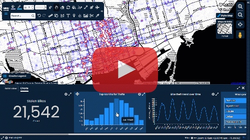
From olden Nautical and Portolan Charts to today's GIS, we've come a long way in how we look at data. Before we jump into all the different ways we can use charts in GIS, let's first see the kinds of charts available with Scribble Maps:
- Distribution (Bar Charts): These consist of rectangular bars, with the length or height of each bar representing the value of a variable. They are ideal for comparing and displaying discrete categories of data.

- Rank (Row Charts): A variation of bar charts, row charts display data in horizontal bars. They are particularly useful when you have lengthy category labels or wish to emphasize data comparisons in a horizontal layout.

- % Share (Pie Charts): Circular charts are divided into slices, with each slice representing a proportion. They're perfect for illustrating parts of a whole or comparing percentages.

- Summary (Card Charts): Also known as card visualizations, these are a compact and concise way to display key information or metrics in a small rectangular "card" format. They are commonly used in dashboards, reports, and data-driven applications.

- Trend (Line Charts): These display data points as markers connected by lines. They are excellent for showcasing trends, changes over time, or continuous data.

Applications of Charts in GIS
- Spatial Analysis: Chart View enables spatial analysts to identify patterns, relationships, and trends. By overlaying charts onto maps, analysts can visualize how attributes such as population density, income levels, or disease prevalence vary across diverse geographic areas. This spatial analysis approach not only facilitates the identification of spatial patterns but also helps in making informed decisions related to urban planning, resource allocation, and environmental management.
- Data Exploration: Chart View offers a dynamic and interactive way to explore and filter through vast amounts of data. Users can create an array of charts, including bar charts, line charts, and scatter plots, to delve deep into attribute distributions and uncover anomalies. This capability is instrumental in detecting data outliers, discovering concealed patterns, and gaining profound insights into the underlying data.
- Presenting Insights: Chart View helps GIS professionals showcase their discoveries and insights in an engaging visual way. Seamlessly integrating charts and diagrams into presentations and reports can effectively communicate complex ideas to a broader audience, fostering better understanding and engagement.
Best Practices for Chart View Utilization
- Choose the Appropriate Chart Type: Consider the nature of the data and the message you want to convey when selecting a chart type. Bar charts excel at comparing categories. In contrast, line charts are ideal for tracking trends over time.
- Maintain Data Accuracy: Data integrity is paramount. Ensure that the data you use for chart creation is accurate and up-to-date. Any discrepancies or errors in the data can lead to misleading visualizations.
- Leverage Interactive Features: Chart View's interactive features are a treasure trove of insights. Take full advantage by drilling down into specific data subsets, applying filters, and exploring the data from various angles. It's a powerful way to uncover hidden trends and outliers.
- Design for Clarity: Keep your charts clean and uncluttered, focusing on conveying the most critical information. Utilize appropriate labels and colour schemes to enhance clarity and readability.
Chart View — Your Guide to Powerful Visualization
Chart View stands as an indispensable companion. With the ability to bring data to life through charts and graphs, it revolutionizes how we interpret and act on spatial data. Whether you're an urban planner, an environmental scientist, or a decision-maker in any field, Chart View is your window to uncover the secrets hidden within geographic data.
Unlock the full potential of your GIS software by embracing Chart View. It's not just about maps; it's about visualizing the world in a whole new light.


.png)
Comments
Post a Comment
Comments are moderated, thanks for your patience.